In the Nelson-Atkins Museum in Kansas City MO, there’s a small panel of a Virgin and Child painted about 1455 by Hayne de Bruxelles. The Nelson-Atkins has kindly allowed me to reproduce the painting on my blog so I can share with you the qualities that mesmerize me. I first saw the painting in a book they published in 2005 called “German and Netherlandish Paintings 1450-1600” by Burton L. Dunbar (here’s a link to the book on Amazon) but I haven’t found it reproduced anywhere on the web. Here it is:
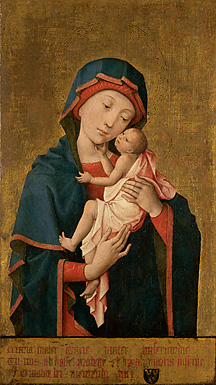 Hayne de Bruxelles, French or Flemish (active 1450s). Virgin and Child, ca. 1454-1455. Oil on wood panel, 24 9/16 × 14 ¼ inches (62.4 × 36.2 cm). The Nelson-Atkins Museum of Art, Kansas City, Missouri. Purchase: William Rockhill Nelson Trust, 32-149.
The source image for this panel is this lovely and celebrated 14th century painting ‘Notre Dame de Grace’ which can be found at the cathedral at Cambrai, France; here’s their web page and a small reproduction of the source:
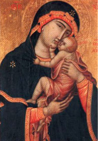
Before I launch into my discussion about the Hayne, could you step to the side with me for a second and indulge in the realism of the gesture in the Notre Dame de Grace, where the infant grabs onto a fistful of chin and another of robe and squeezes, as all infants do? I adore that. And both paintings also show a wonderful nearness of noses, and any mom can relate to breathing the sweet breath of her baby in that way. It’s so adorable.
Loads of variations on the Notre Dame de Grace have been made by numerous artists throughout history, and it’s been established that Hayne was specifically commissioned to reproduce it. He made at least two copies, and that act in itself brings up all sorts of interesting points about painting as it relates to multiple originals and as they relate to prints and printmaking, especially when you note that the printing press -and the wider understanding of making exact duplicates - only made its way onto the human scene 20 years before Hayne painted his copies. FYI, one copy is in Kansas City and the whereabouts of the other are unknown.
But it’s not the copying, or the multiples, or the ideas about dissemination of imagery that are compelling to me; that’s simply background information. As with any work, it’s the image rather than the process that keeps me engaged, and notably Hayne’s ‘Virgin and Child’ has been reinterpreted, or edited, with changes to the source that reveal a great understanding of the visual tools of imagemaking.
Here’s what transfixes me in particular: the form, weight, and tilt of the Virgin’s head as it balances perfectly upon the Child’s carefully proportioned hand and arm. I could stare at it for hours, moving along a line from the open hand to the jawline, around the head, and back again to that impossibly small arm, which is somehow exactly the right size; not so small as to be comical, but not proportioned correctly to be realistic. Instead the arm has that doughy chubbiness that infants have, and if you’d care to relate the form to the content more pointedly, you could say the arm and hand succeed in emphasizing strength and weakness at once. Sacred or secular, I’ve rarely found 2-d forms so perfectly or compellingly balanced that also appear free to move (an example will come in a later post).
Here’s a drawing I made of the forms in question to make clear to you the balance I’m so keen on, and I hope the value scale helps you see this more clearly. First, note the overall shapes and forms of the head and the arm/hand, here:

Then look at how it seems you could keep stacking layers of two-dimensional weight onto that teeny hand/arm, beginning with just the face:

Then add the first head covering:

and then the outer robe, that encapsulates the full weight of the head:

That little thumb is so strong to have such weight set upon it, and the fingers too; it’s as though her neck were hardly required to do any work.
Then note how smoothly the lines move from the open palm to the chin and jaw, in that tender gesture. I’ll limit my observations on movement and lines of composition to this one jpg:
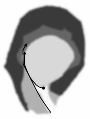
Amazing - somehow perfectly balanced. It just slays me.
But I’ve been hard pressed to find much writing about this panel at all, save for the book I mentioned above, so now you have my two cents. You’re welcome to add your comments too.